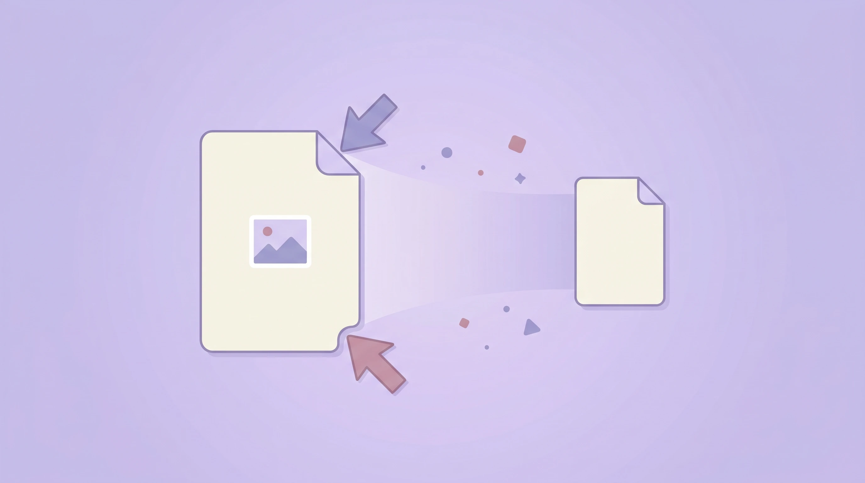
Resizing images sounds simple, but it has a huge effect on visual quality, loading speed, layout stability, and social media presentation. Many teams still upload originals straight from a phone or design file, even when those assets are far larger than the places where they will actually appear. That wastes bandwidth and often makes sites feel slower than they should.
The good news is that resizing is one of the easiest improvements you can make. With a browser-based tool like our Resize Image tool, you can set exact dimensions, keep aspect ratio under control, and prepare images for websites, product pages, ads, or social posts without uploading files to a server.
Why image resizing matters
Image dimensions affect more than appearance. A file that is displayed at 1200 pixels wide but uploaded at 4000 pixels wide forces the browser to download and decode unnecessary data. Even if the page still “looks fine,” performance suffers.
- Faster loading because browsers transfer fewer pixels
- Better Core Web Vitals when large hero images are right-sized
- Cleaner layouts when assets match the intended container size
- More consistent social previews when platform-recommended dimensions are used
Resize vs compress: what is the difference?
Resizing changes an image’s dimensions, such as turning a 3000×2000 photo into 1200×800. Compression reduces file size through encoding. They solve related but different problems.
In practice, you often want both. First resize an image to the size it actually needs to be, then compress it if you want smaller delivery size. If you only compress a file that is still far too large in dimensions, you are leaving a lot of performance gains on the table. That is also why our image compression guide pairs naturally with resizing.
Recommended image sizes for common social platforms
Platforms change recommendations over time, but these are reliable starting points for common publishing needs:
- Instagram post: 1080×1080
- Instagram story / reel cover: 1080×1920
- Facebook share image: 1200×630
- X / Twitter header: 1500×500
- YouTube thumbnail: 1280×720
- LinkedIn share image: 1200×627
These dimensions are not magic rules, but they help you avoid awkward crops, soft previews, and off-center compositions. Quick presets are helpful because they remove guesswork from repetitive export tasks.
How resizing fits responsive web design
Responsive design is not only about CSS. If your website shows the same huge desktop image on a small mobile viewport, the browser still downloads that oversized asset unless you prepare better variants. Resizing helps you create images that match actual layout needs.
Common responsive use cases include:
- Hero banners with separate desktop and mobile crops
- Blog images sized to the article column rather than full-resolution originals
- Product cards using consistent thumbnails for cleaner grids
- Open Graph previews exported specifically for sharing cards
The best image size is not the biggest one you have. It is the smallest one that still looks correct in the place where users actually see it.
DPI and PPI: what matters for the web?
This is a common source of confusion. People often hear that web images must be 72 DPI or 300 DPI, but for browser display, pixel dimensions matter far more than print DPI metadata. Browsers care about how many pixels the image contains and how those pixels are laid out on screen.
DPI and PPI are important in print workflows, but for websites and social media, your main questions should be:
- How wide and tall will this image appear?
- Is the file oversized for that layout?
- Will it still look sharp on high-density screens?
Upscaling vs downscaling
Downscaling usually works well because you are removing pixels. A large photo often becomes cleaner and lighter when reduced. Upscaling is different. When you enlarge an image beyond its original dimensions, the browser or editing tool has to invent new pixels. That can create softness, blur, or jagged edges.
As a rule of thumb:
- Downscale freely when the original is much larger than needed
- Upscale cautiously and only when the source has enough quality headroom
- Avoid enlarging screenshots or text-heavy graphics because artifacts become obvious fast
How to resize images without distorting them
The easiest protection is to keep the aspect ratio locked. If you change width while the ratio stays linked, height updates automatically and the image keeps its original proportions. This prevents stretched faces, squashed product shots, and distorted layouts.
Aspect ratio should only be unlocked when you are intentionally fitting an image into a new shape and you understand the trade-off. In those cases, cropping is often a better choice than force-stretching.
When batch resizing saves the most time
Batch resizing is especially useful when a whole set of files needs the same target dimensions. Common examples include marketplace product images, blog thumbnails, team profile photos, social campaign graphics, and gallery uploads. Applying one size rule across the batch keeps publishing consistent and reduces manual export work.
If the entire batch shares the same destination, browser-based resizing is often enough. For more complex design variations, you may still need manual art direction, but batch resizing handles the repetitive part efficiently.
Practical best practices
- Start from the final use case, not the original camera resolution
- Keep aspect ratio locked unless you have a strong reason to change it
- Use presets for social media to reduce mistakes and speed up workflow
- Resize before compressing for better total savings
- Keep originals when assets may need other outputs later
Final thoughts
Image resizing is one of the simplest ways to improve both visual consistency and site performance. It helps you match assets to real layouts, prepare cleaner social previews, and avoid shipping far more pixels than users need.
If you want a fast, private way to set exact dimensions in the browser, try our free Resize Image tool. It supports JPG, PNG, and WebP, includes aspect-ratio lock and quick presets, and makes batch resizing much easier.